
Lection B: Dynamic symbology based on an Excel-formula
Task: Add a new column in Excel, conduct a calculation in the new column and visualize the result in ArcMap with a new symbology.
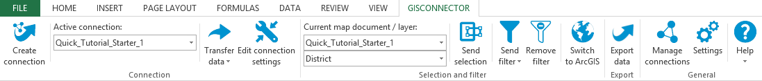
1. Switch to Excel by pushing the button  "Switch to Excel" in the GISconnector toolbar.
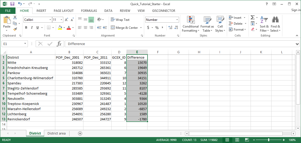
2. Add a new column with the title „Difference“.
3. Now calculate the difference between the population of 2011 and 2001 in the topmost cell (=C2-B2) and copy the formula downward.
4. Format the column as Number without decimals.
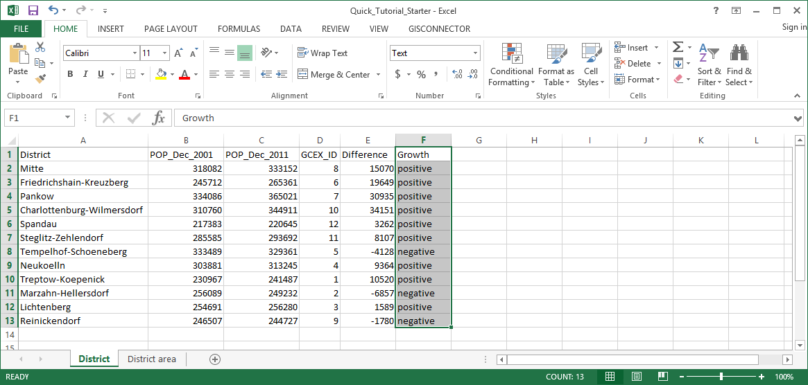
5. Add a new column with the title "Growth".
6. Evaluate the population growth using an IF-formula. If the difference of the population numbers is less than 0, the growth is negative, otherwise it is positive: =IF(E2<0,"negative", "positive")
7. Insert this calculation in F2 and copy it downward.
8. Format the column as Text (Important: not before calculating the formula).
9. Now transfer the data from Excel to ArcGIS with the button  „Transfer all data“ in the dropdown "Transfer data".. The GISconnector switches to ArcGIS automatically after the transfer.
10. Open the layer properties of the layer „District“ in ArcMap.
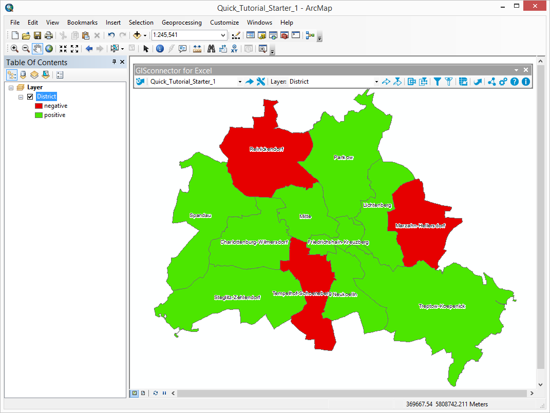
11. Represent the symbology in graduated colors with the help of the field „Growth“ as follows:
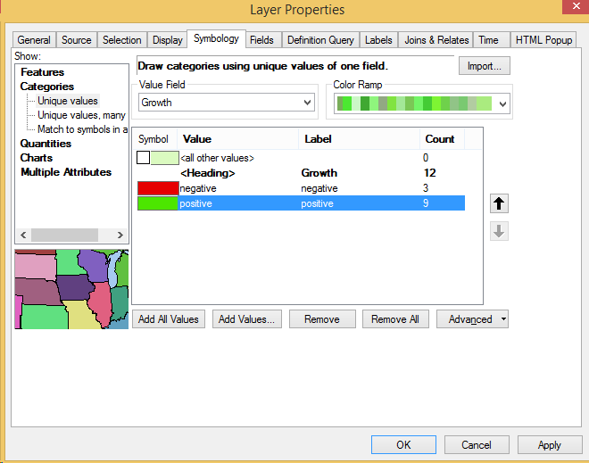
12. Now the symbology is based on the numbers in the column „Growth“ of the Excel worksheet.
The GISconnector for Excel enables the visualization of a layer based on dynamic values of an Excel worksheet which is going to save you considerable time.